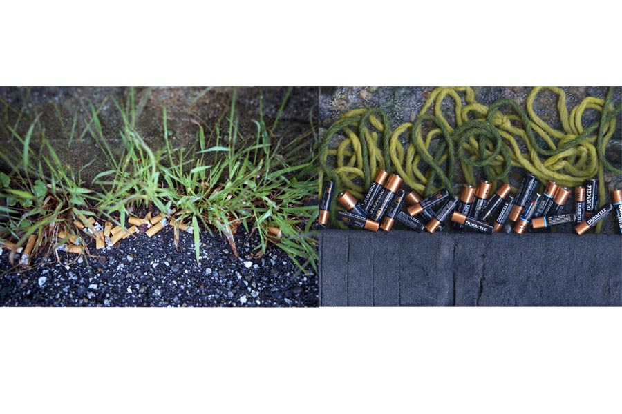
1. This diptych is particularly effective and coherent as a single image. Putting the images side by side works much better. I'm impressed with your ability to capture such similar color palettes in the two images and call attention to such a common scene and make us look at it in a new way. 2. I love the way you use pattern in this diptych. It helps the images fit together as one. The orange in the bottom image really helps bring out that tone in the top one, creating an eye-catching color combination. 3. I, personally, find this one the most effective. The pentagonal shape you made between the two images with the purple lines and tacks is an interesting and creative way to merge the two. It creates an appealing composition that is balanced out by the deliberately place colors. 4. The moment you capture, of these people walking toward the camera, is pretty funny. The balloons in the scanogram really complements the quirkiness of the characters on the left. Also think this placement of the images works much better. Nice work!


1. This diptych is particularly effective and coherent as a single image. Putting the images side by side works much better. I'm impressed with your ability to capture such similar color palettes in the two images and call attention to such a common scene and make us look at it in a new way.
ReplyDelete2. I love the way you use pattern in this diptych. It helps the images fit together as one. The orange in the bottom image really helps bring out that tone in the top one, creating an eye-catching color combination.
3. I, personally, find this one the most effective. The pentagonal shape you made between the two images with the purple lines and tacks is an interesting and creative way to merge the two. It creates an appealing composition that is balanced out by the deliberately place colors.
4. The moment you capture, of these people walking toward the camera, is pretty funny. The balloons in the scanogram really complements the quirkiness of the characters on the left. Also think this placement of the images works much better.
Nice work!